 |
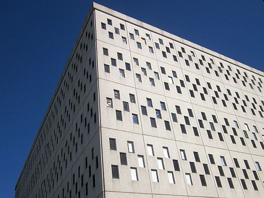
| "Punch card" windows along the northern face of Ahmanson Hall at Otis College |
How will buildings of the future look? How can an architect in the present discern the shape of an aesthetic yet to come? Is futurism accomplished by an emphatic rejection of the Past? Or is it the extrapolation of modern cutting edge imagery projected into structural design?
We discussed the concept of futurist architecture when visiting the Space Park campus in Redondo Beach. Today, we are visiting the old IBM Aerospace Building in the Westchester neighborhood of Los Angeles. It is now part of Otis College of Art and Design, but was originally built for IBM by Eliot Noyes in 1963. Renamed Ahmanson Hall, this structure is a fine example of futurist architecture.
It is a seven story cube with each face segmented into "punch card" patterns. Clearly, Noyes took the look of the computer technology of his day and projected it conceptually as a design scheme for a "futuristic" building. Nearly fifty years later, it doesn't look anything like how the future of architecture actually turned out, but it does eloquently express a "futuristic" forward-looking aesthetic.
 |
| Otis' Ahmanson Hall, the "Punch Card" Building, was built in 1963. |
In this regard, futurist architecture shares certain qualities with science fiction. The goal of a good SF story isn't to "predict" the future, but to consider a contemporary issue in the light of future potentialities. In the Punch Card Building, Noyes foresees the importance of computation in the future. So, the symbolism of his era's computer technology is utilized as a design principle to enclose the workspace. The residents of the Punch Card are literally surrounded by the presence of computation.
In this regard, we can consider the Punch Card Building to be one of the first structures of the Information Age. Certainly, computers no longer look anything like that, but the idea which it represents has come true. Our society is surrounded and pervaded by contemporary "punch cards."
 |
| The northwest corner of Ahmanson Hall |
 |
| The northeast corner of Ahmanson Hall |
Another building was added to the Otis Campus in 2001, the Galef Center for Fine Arts. It's a wonderful contrast of contemporary neo-modernism, shiny and complex. It's an engaging design, but I wonder how interesting it will appear in fifty years. The Punch Cards still speaks to us, albeit in an outdated style. What does the Galef Center say? What will it say?
 |
| Galef Center for Fine Arts, designed by Frederick Fisher, 2001. |
Enjoy!!!
No comments:
Post a Comment